I haven't made a pattern for the cushion yet, I just made it up as I went along.
27 September 2010
City of Love - La ville de l'amour
I haven't made a pattern for the cushion yet, I just made it up as I went along.
All my friends.....
Actually, my son Brendon's friends are getting married.
Recently, Kylie from My Flying Ducks was married. Take a look here at the wedding present I made for Kylie and John.
This weekend I finished a small gift for another of Brendon's friends, David, who is getting married next month. He and Brendon went to school together and shared apartments over the years.
My Creative Space
Michelle from Belly Designs made mentioned in 'Project: Grassdragon Print' about my latest print being in repeat on a larger area.
It took a little bit of time, and I had intended on doing it while still on holidays. Time got a way and I'm now back at work.
I completed the print yesterday. Hope you like it.
18 September 2010
Favourite Things - Week 12
For years I've always done something creative. Mainly sewing, but in recent years I have done some study and now have a Certificate IV in Colour & Design, a Diploma in Visual Arts - Surface Design (Textile and Homewares etc etc) and another in Colour Design (Residential and Commercial colour styling).
So for this week I thought I'd showcase some of my mood boards from the courses.

Waverton - A renovation. I won the Dulux Award for Creative Colour Application with this one in 2009.
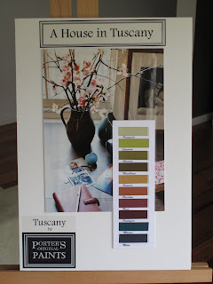
These were from a last minute assignment we were given, also in the Colour Design course. My entry was one of the 10 finalists. The award was sponsored by Porters Paints. I called my range 'Tuscany' with a play on words for 'A House in Tuscany' and 'A Garden in Tuscany.
 A Bar/Restaurant refit complete with samples of tiles, paint, fabric and wallpaper. Yes!! I used a Florence Broadhurst wallpaper. Well, what else did you think I'd use!
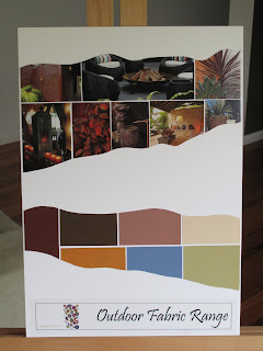
 Lastly, a colour story for fabrics to be used for outdoor furniture. I was really happy with this board.
More Creative Pursuits over at Being Tazim here.
16 September 2010
Muck Designs
This is him pictured with his winning design for the iscd 'Art on the Floor' competition for Designer Rugs. The competition is the major assignment for the end of one of the courses we completed together.
Anthony has a series of images that all have a philosophy behind them. He's been selling them from some of the markets here in Sydney, and with the warmer weather coming up, he'll be back on the market circuit.
Here's some of designs.
 Series of images together - each design has a story.

They all gave me some great feedback on my designs. More designs will be revealed soon.
Check out Anthony's website and his philosophy. It's all about core values and principles.
15 September 2010
Colour Systems - Pantone vs NSC

{Image: Moose & Bird}
I had a bit to do with it last year when I was studying 'Colour Design' at iscd (International School of Colour & Design). For the projects I was completing, it wasn't very flexible. For me anyway, the gurus would be yelling at me now. I can hear them!
 {One of my colour projects from my Diploma}
My educator for this course, just happened to be of Swedish background as is her husband, so they travel back to Sweden quite regularly. She introduced us to Natural Colour System (NCS) - a colour system from Sweden (and not a Crime Scene investigation unit).
Apparantly everyone over there lives and breathes this system, just as the rest of the world does with Pantone. The theory with this system is quite indepth. And they're are on their way to being embedded in the design arena to the same level as Pantone.
Anyway, my point is, that whatever we do, see or buy, has some sort of connection to colour somewhere along the way from raw materials to finished product, including packaging of our foods!
Interesting, I thought, how colour is SO connected to our everyday life. Not just the magnificent colours Mother Nature provides for us.
We know what we like when we see it, but there is a heck of a lot of colour theory that goes on behind the scene.
 {is White a colour??}I always thought my favourite colour was green or orange (different versions of each depending on what and where the colour is intended).
Turns out recently, through unconcious choices, I've found that blue probably is my favourite colour. When choosing a blog template for my new blog (that's still a way off, secret squirrel stuff), the one that appealled to me was - another blue one! Same for my recent projects - Baby Love, the Tote Bag and Pin Cushions.
What's your favourite colour?
Possibly not the one you think it is. Really take a look around your environment, and see which colour stands out the most! Maybe you'll come to the same conclusion I did - It's not actually the colour you think it is! Who knows, maybe it is. And maybe it's more than one.
But do you ever really think about it? I didn't until recently.
PS I still like greens and oranges and I'll still probably buy what I like. Betcha it'll be either green, orange or BLUE!
Cup Cake Pin Cushion
Sort of made this one up as I went.
Problem is, now I don't think I can bring myself to use my new pin cushion. I still like my mouse.
Project: New Piece of Florence Broadhurst
On one of my excurions to Signature Prints, I picked up this beautiful white silk piece, printed in off-white and browns in the 'Cranes' design.
'Cranes' is, I think, the most iconic design of the Florence Broadhurst range, but that's just my opinion.
Sorry the photos aren't great. I took it late-ish in the afternoon and do really need to get son #1, the photographer, to advise on a good 'point and shoot' DSLR. (Or maybe hint for Christmas??)
I have a couple of display easels, which I love as a great way to decorate, but have never used them. So now I have. This is in the family room, behind the lounge that faces my other Florence artwork, 'Egrets' wallpaper art.
You can see a photo of 'Egrets' and read about how to make 'Wallpaper Art' here.
So, now to how I did it. The instructions look like a lot, but it's easy really.
Materials:
- Canvas (blank from Spotlight, Lincraft or the like) - a cheap one, to the size you want. You can disguard the canvas if you wish. I did, leaving it on makes the artwork look a bit bulky at the sides.
NB the blank canvas I bought was the one with a low profile (depth) frame. If you buy one with the deeper profile, you'll need to add a bit more over hang of fabric - refer below.
- Fabric - your choice and should fit the canvas frame size plus hangover of about 10cm every side. Look for a mid-weight fabric. Light weight tends to stretch and rip/pull, heavier weight is a bit tough to handle and can also look bulky when you fold over the corners.
- Backing fabric - as above, to fit your size frame plus hangover. I used white 100% cotton for mine.
- Staple gun
- A pair of canvas pliers to assist stretching the fabric over the frame, if you have them. If not, get an extra pair of hands to help you stretch and hold the fabric while you staple.
- Finishing tape - not sure what they call it, but you can get it from art supplies and/or framing shops. It's brown in colour and they use it to tape off the backs of framed artwork. They'll know what you are talking about when you describe it to them. I bought mine in Taree, haven't had time to scope the Sydney scene for this yet. Will let you know when I do.
Instructions:
- Prepare your frame - i.e. take off the canvas, if that's is what you are prepared to do
- Iron your fabric pieces, the design piece AND the backing piece
- Cut fabric pieces to size, together. Lay one on top of the other, place your frame over them, measure your over hang and cut to size
- Cover your work area/bench so as not to damage or mark your design piece. Lay your fabrics down first with the design facing down, then your frame. You should have - design piece, backing piece, then frame.
- Staple ONE side all the way along except for about 5 - 10 cms from the corner (depending on your frame size). You need room to fold over your corners at the end. Work from the middle out to the sides.
- On the OPPOSITE side to the one you have just stapled, stretch the fabric using either the canvas pliers or your helper, until the fabric is taught but not too tight. Pulling too tight will show 'dips' where your staples are pulling.
- Staple the fabric from the middle of the side you are working on, and out as above in step 5. Again leave some room to do your corners.
- Before moving to the other 2 sides and repeat the stapling process, check the front of your artwork, see if it's pulling anywhere.
- While you are doing this, from the middle of the remaining unstapled sides, pull to stretch (& hold) the fabric over the frame, making sure none of the fabric is twisting. You may need your helping hand again here. Hold these in place at the middle and put a holding staple there.
- You can now staple from the middle and out again, stretching as you go. Remember, leave a bit at the end to help with doing the corners.
- Fold your corners over neatly and staple. Up to you how you fold the corners, just make sure they are neat folds, you know, so they don't look bulky from the front.
- Use finishing tape to cover all edges and staples on the back of your frame.
Have a go and good luck.
If you need help, email me on designed.to.a.t@optusnet.com.au
Moose & Bird - 100th post giveaway
This is the very first giveaway I've entered since starting in January this year. Not to 100 posts yet, but will have to think of something for it when it happens!
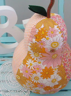
Here's the prize, her lovely orange and pink Pear Shaped Pillow.
 Good Luck everyone...Terese
14 September 2010
Project: Bag - 'Grassdragon' print
Finally had some time to really concentrate on doing some screen printing. I did a course back in July and while I've had everything I needed to get started, time has not been my friend.
Even while I've been on holidays, I had so many other things on my list of 'to do' things, I was getting worried I wouldn't get there.
Anyway, here's the first of my designs. A few more to come over the next little while. A full day is planned for tomorrow.
The final design is, well the one I printed, 'Grassdragon'.
I'm just going to refine it a little bit. It's prints a bit too fine. I'd like to get some more ink on the fabric. Playing with that tonight.
I called it Grassdragon as it's a combination of a flowering grass and a dragonfly. I love dragonflies, but didn't want the 'usual' look.
 Screen ready to go.
Close up of 'Grassdragon' ready to go on the exposed screen.
Screen set up on my new little gadget handyman made for me, to my specs. Caused a few heated discussions, but we got there. Works a treat!
Little tote bag printed and embellished. I printed it with a colour I mixed myself, (have kept the 'recipe' though). I really liked the colour, so will probably use it again.
Bit of a close up. I trimmed the top of the bag with a fabric from my stash. It's one from Spotlight. Then I found a check I'd bought years ago to embellish a singlet for my neice, so I made a fabric rosette out of that. Just finished it off with the middle of the rosette from the same fabric as the trim.
More creative people here.
Admit it...I have a fabric stash
I put this out there a little while ago and at the time I didn't have too many followers nor did I follow a lot of blogs myself.
Since I've been reading so many more wonderful blogs relating to craft, sewing, handmades and fabrics, I thought I'd pop on over to the blogs I've been reading and let you know I'm here.
Have to admit, I am a bit of a stash lover. It's getting bigger by the day since I've reignited my passion for all things handmade.
My latest is coming from Quilt Home, as I was after some more Amy Butler designs.
So, let's see what happens this time.
If you are out there and you have a stash, I'd love to hear from you.
Here's the code for my button, and don't forget to link you post back to here. Or you can get it from my side bar.
Thanks everyone. Hope to hear from you.
09 September 2010
Project: Baby Love
Before I found out she knew it was a girl, I had completed my first pressie for the baby. Not knowing the sex of the baby, I decided to go with neutrals with a bit of blues, greens, and aquas.
Amy Butler fabrics and patterns are a big favourite of mine, so with some fabric I had from the night I met Amy and one of her patterns, I made this for the baby's room.
She is a fantastic artist and I can't wait to see what she's done for the nursery. She's only just finished work last week and is now on 12 months maternity leave.
While I've been on holidays I've finished another gift, bunting for the nursery, which I will give to her when the baby is born. It brings in complimentary fabrics, some Amy Butler and some fat quarters from Spotlight.
- Template
- Scissors or cutting knife. The rotary cutters quilters use is also very good for this type of project.
- 5 patterned fabrics - fat quarter size is great and will give you sufficient fabric to make all the triangles needed for this. My project has 16 triangles (double sided) which makes about a 3 metre length.
- 3 metre length (packet) of bias about 2cm wide - I used Birch brand from Spotlight
- 3 metre length of matching trim - the zig zag I used was a 2.7 metre length, but this was still long enough
- Thread and sewing machine
08 September 2010
New work area ideas
I need to find the cupboard first before I can get a quote for the glass. My biggest hope is to find one with glass already in it.
However....I don't mind the look of these, so if I can find something similar......!? I would probably be happy enough to leave it as is.

 This one below is more in line with the French feel, but only shelving. I'm liking the colour though and have a couple of things in this colour from Kikki K for the room anyway. This might dictate the colour base for the face lift.
If the plan for the french style look in the work area doesn't fit in with the rest of the house, I might not go down that road. Still so much to decide and plan.
The look I'm thinking of isn't an 'all out' french style, just a bit of french 'flavour'.
 How great is this printer's cabinet?
 Very organised work area below. Not really me. I like to be tidy, but I also would like some flair.
I love the colours in this next room. Favourite, the fabric on the chair, and the colour!!! The window sill in my work room is quite low off the floor, so I'm unable to set up a desk at the window. Need to work around it somehow. If the Ikea draws on castors fit under the height of the window sill, it'll go there.
