TYPOGRAPHY
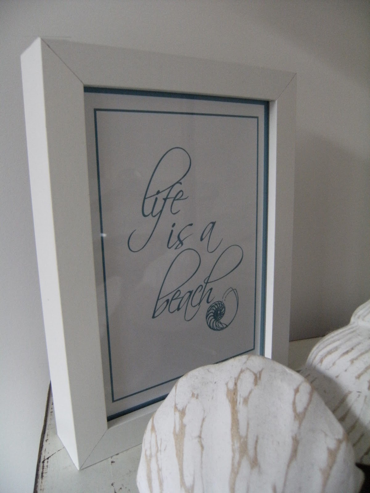
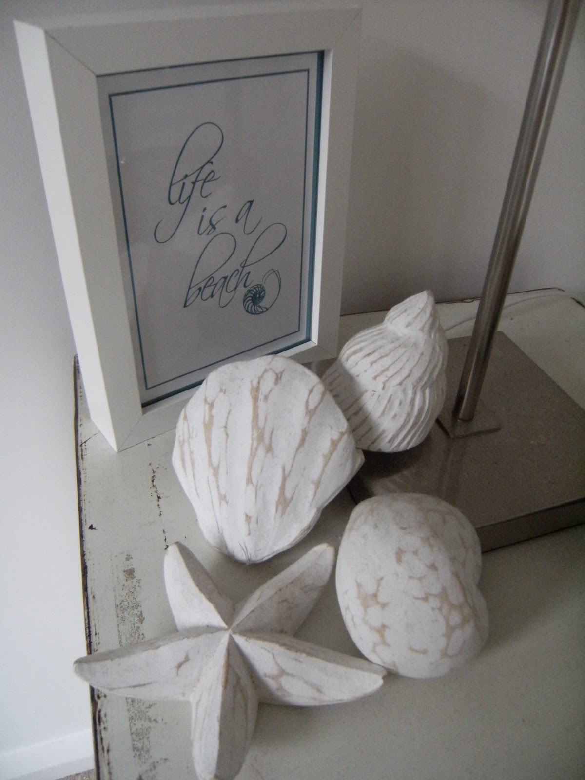
Janette from My Sweet Prints got my mind working when I saw her great ideas using typography as her Art. For the spare bedroom's decor, which I suppose is 'technically' influenced by the beach location of the house, I've done a simple 'life is a beach' saying in an Ikea frame, finished with a sketch of a nautilus shell.
Thank you Janette.
BTW the shells are from a little gift shop in Port Macquarie, can't remember the name of the place though, sorry. They are sculpted from balsa wood. Very cute and they fit in so well with what I'm trying to achieve in this room. The bedside table is looking a bit crowded at the moment, but this will change when my Bulter's table arrives from Whiteport.
I've always loved text in art and I'm a HUGE fan of vintage advertising and film posters. Art.com have some fabulous vintage artworks/posters. I was a regular user of the site for inspiration and images when I was doing my design study over the last few years.
My favourite is the Alfred Hitchcock 'Vertigo' poster. I saw it recently on a television show I was watching, can't remember what show it was, but as soon as I saw the print, up went the shout, 'That's my print!'.

Another frame I've done is this one, 'Nothing in life is to be feared....It is only to be understood'. A quote from Nobel Prize winner Marie Curie. I think it says a lot just with those few words.
The quote is complimented with a background character from Zen calligraphy. I chose Zen because of the philosophy behind these beautiful characters....
True creativity is not the product of consciousness but rather the "phenomenon of life itself". True creation must arise from mu-shin, the state of "no-mind," in which thought, emotions, and expectations do not matter.


FURNITURE and ARTWORK
The space at the bottom of the stairs is now filled.
My search took about 18 months, but I finally found another kang table to suit (console table, they call them 'kang' but I'm not sure what it means).
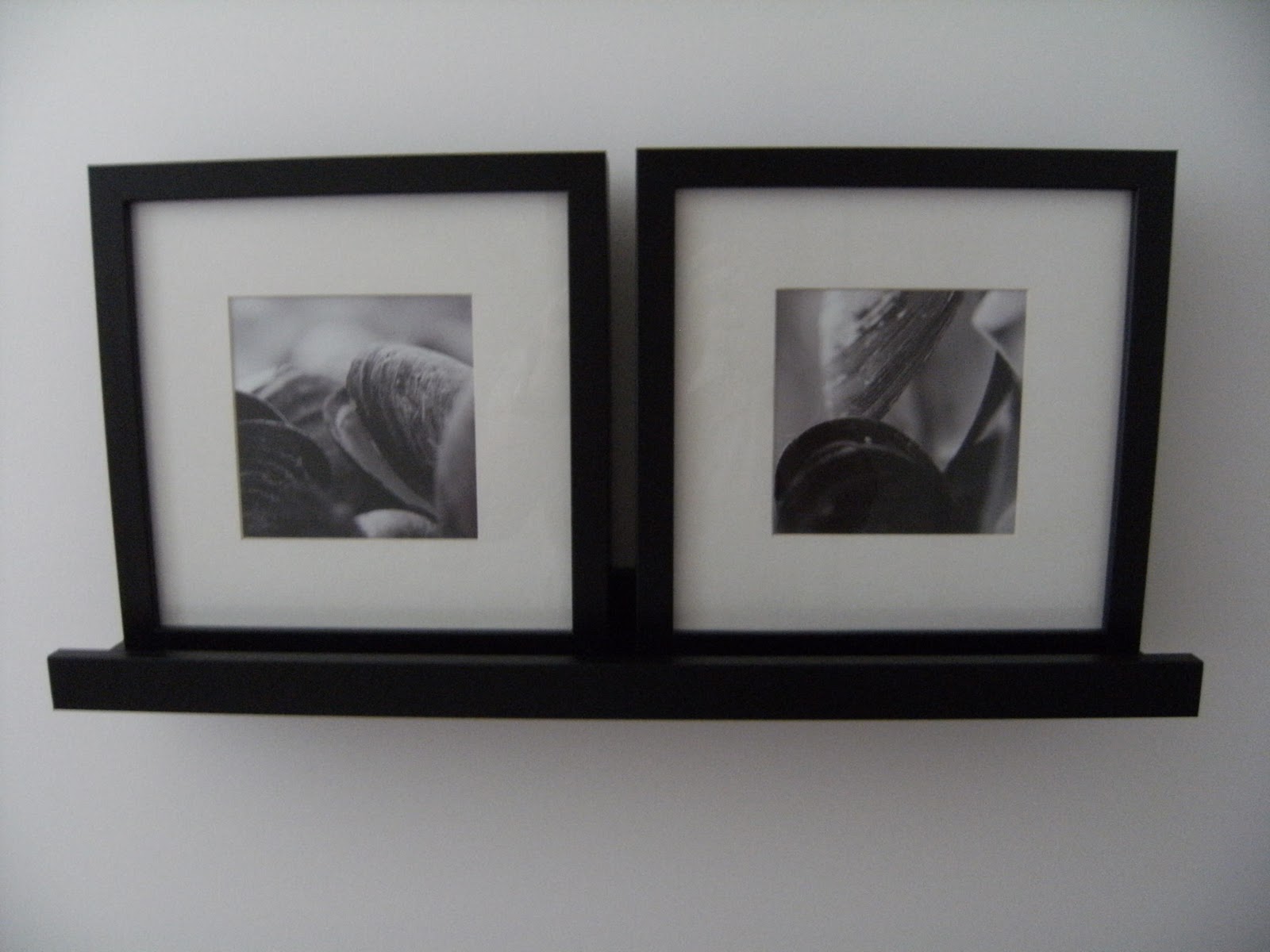
The Ikea frames and prints are mounted on shelves (another Ikea wonder) and are complimented with some smaller frames that I've filled with shells, seed pods and starfish. The backing for the starfish is just a medium weight sandpaper. Simple but effective. (Sorry, that photo didn't turn out very well, so I haven't posted it.)

I've had the rattan travel bags for about 4 years now, and they've been lonely up until now, sitting on the floor in the corner.
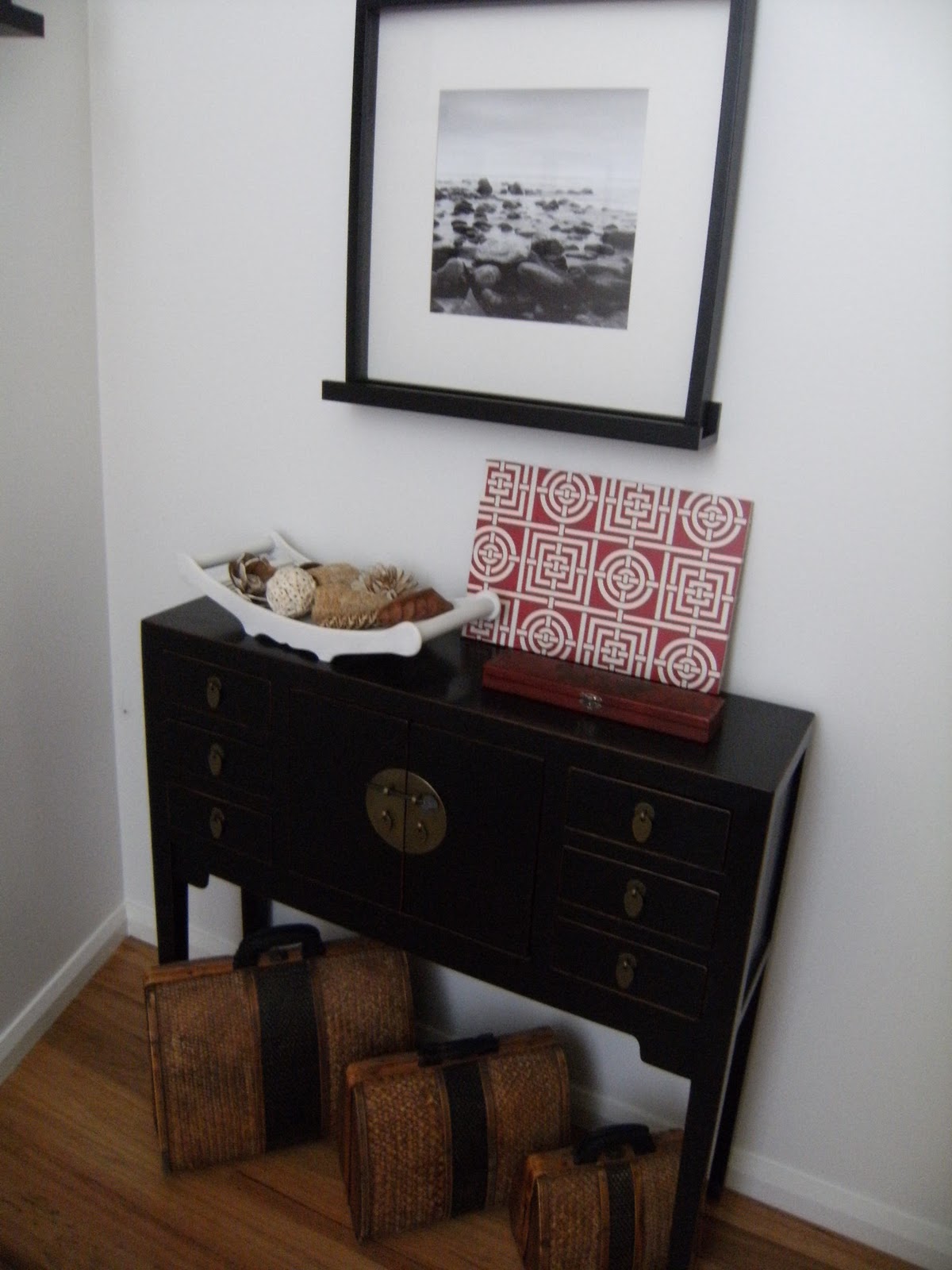
There was some red 'Circles and Squares' Florence Broadhurst wallpaper left over from the wedding pressie I made Kylie C, from My Flying Ducks, so I grabbed a piece of leftover mdf and covered it using some spray glue.

I collect old chinese calligraphy brush sets and have used a set in a red case to add some more red to the corner. Last thing to do when I can find and purchase a ceramic or stone urn, is to use the 'free' bamboo pieces I 'obtained' from a flower arrangement at work about a month ago.
Well, they were only going to through them out!
Looks like the perfect place for a holiday to me!
ReplyDeleteThey look soooo good!!! I'm so chugged that you would find some inspiration from my work, so cool!
ReplyDeleteHope you're having a great weekend!
Jxx
Whoops meant chuffed, silly iPhone :)
ReplyDelete