Showing posts with label iscd. Show all posts

18 September 2010

Favourite Things - Week 12

It's been a little while since I've been over to Being Tazim for The Favourite Things Project. Interestingly this week is about Creative Pursuits.

For years I've always done something creative. Mainly sewing, but in recent years I have done some study and now have a Certificate IV in Colour & Design, a Diploma in Visual Arts - Surface Design (Textile and Homewares etc etc) and another in Colour Design (Residential and Commercial colour styling).

So for this week I thought I'd showcase some of my mood boards from the courses.


Waverton - A renovation. I won the Dulux Award for Creative Colour Application with this one in 2009.


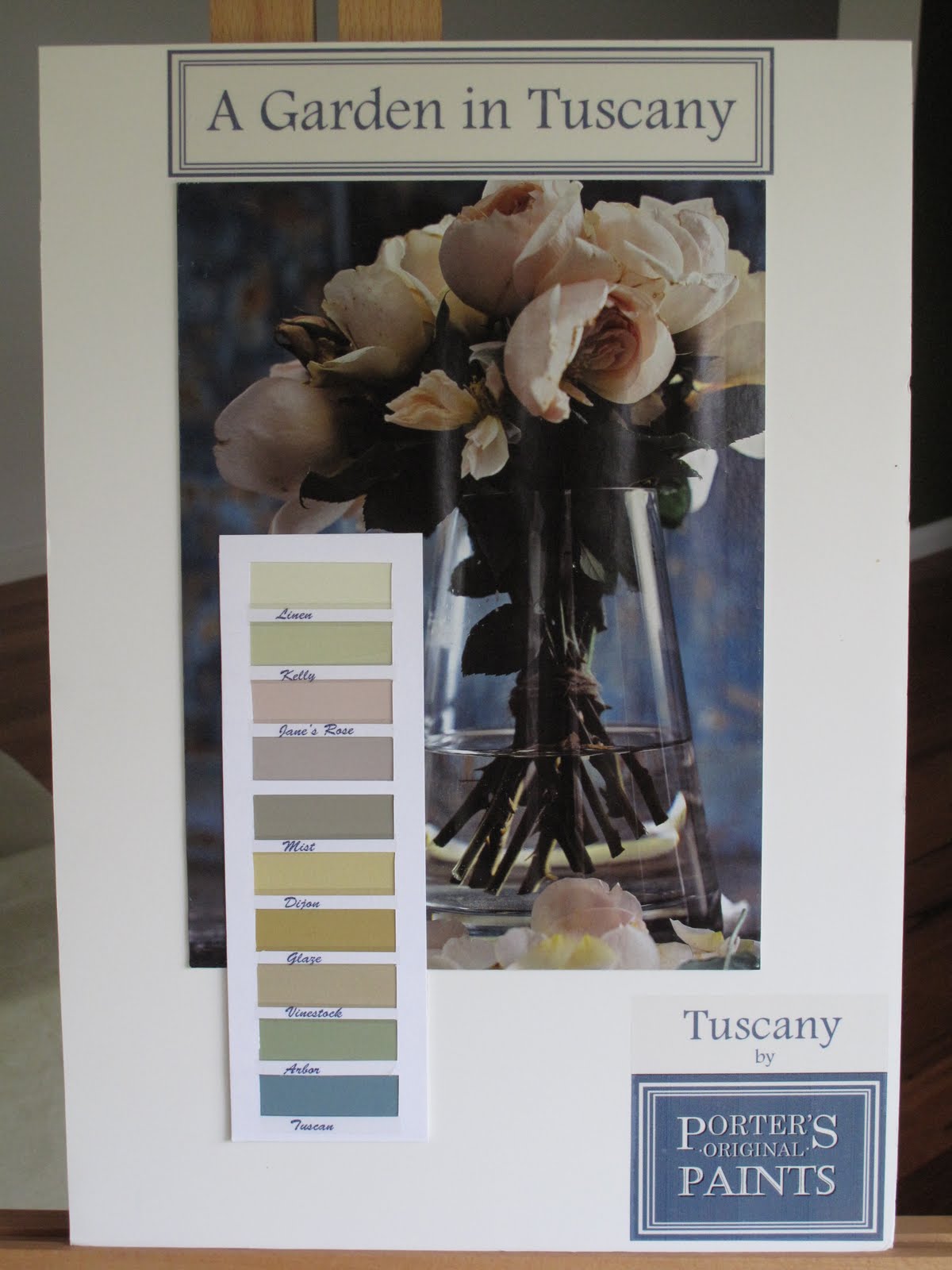
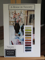
These were from a last minute assignment we were given, also in the Colour Design course. My entry was one of the 10 finalists. The award was sponsored by Porters Paints. I called my range 'Tuscany' with a play on words for 'A House in Tuscany' and 'A Garden in Tuscany.

A Bar/Restaurant refit complete with samples of tiles, paint, fabric and wallpaper. Yes!! I used a Florence Broadhurst wallpaper. Well, what else did you think I'd use!

Lastly, a colour story for fabrics to be used for outdoor furniture. I was really happy with this board.


More Creative Pursuits over at Being Tazim here.

16 September 2010

Muck Designs

{Image: indesignlive.com}
Let me introduce to you a friend of mine, Anthony Manuatu from Muck Designs.

This is him pictured with his winning design for the iscd 'Art on the Floor' competition for Designer Rugs. The competition is the major assignment for the end of one of the courses we completed together.

Anthony has a series of images that all have a philosophy behind them. He's been selling them from some of the markets here in Sydney, and with the warmer weather coming up, he'll be back on the market circuit.

Here's some of designs
.

Series of images together - each design has a story.

Loyalty series

Roses series

Four Gentlemen series
{Images from Muck Designs.com.au}

Something similar I found on Making it Lovely. It's by an American artist, Ryan Kapp.
Five of us from our old classes got together at The Rocks Markets here in Sydney, on Father's Day. It's was good to see them all again as it had been a while.

They all gave me some great feedback on my designs. More designs will be revealed soon.

Check out Anthony's website and his philosophy. It's all about core values and principles.

15 September 2010

Colour Systems - Pantone vs NSC

Seeing the beautiful Moose & Bird photo collage in blue earlier this month, got me thinking back to the 2010 Colour of the Year from Pantone - Turquiose.

{Image: Moose & Bird}

Pantone is an International colour system. Graphic designers, fashion designers, homewares, stationery etc etc, you name it - basically the design industry lives by this colour system.

I had a bit to do with it last year when I was studying 'Colour Design' at iscd (International School of Colour & Design). For the projects I was completing, it wasn't very flexible. For me anyway, the gurus would be yelling at me now. I can hear them!

{One of my colour projects from my Diploma}

My educator for this course, just happened to be of Swedish background as is her husband, so they travel back to Sweden quite regularly. She introduced us to Natural Colour System (NCS) - a colour system from Sweden (and not a Crime Scene investigation unit).

Apparantly everyone over there lives and breathes this system, just as the rest of the world does with Pantone. The theory with this system is quite indepth. A
nd they're are on their way to being embedded in the design arena to the same level as Pantone.

Anyway, my point is, that whatever we do, see or buy, has some sort of connection to colour somewhere along the way from raw materials to finished product, including packaging of our foods!

Interesting, I thought, how colour is SO connected to our everyday life. Not just the magnificent colours Mother Nature provides for us.

We know what we like when we see it, but there is a heck of a lot of colour theory that goes on behind the scene.

{is White a colour??}

I always thought my favourite colour was green or orange (different versions of each depending on what and where the colour is intended).

Turns out recently, through unconcious choices, I've found that blue probably is my favourite colour. When choosing a blog template for my new blog (that's still a way off, secret squirrel stuff), the one that appealled to me was - another blue one! Same for my recent projects - Baby Love, the Tote Bag and Pin Cushions.

What's your favourite colour?

Possibly not the one you think it is. Really take a look around your environment, and see which colour stands out the most! Maybe you'll come to the same conclusion I did - It's not actually the colour you think it is! Who knows, maybe it is. And maybe it's more than one.

But do you ever really think about it? I didn't until recently.

PS I still like greens and oranges and I'll still probably buy what I like. Betcha it'll be either green, orange or BLUE!

06 May 2010

'Cloth Fabric' new Wallpaper range/Porter's paints

Cloth Fabric in collaboration with Porter's Paints have a beautiful range of new wallpapers.

See this style, 'Looking for Water' , in the June issue of Home beautiful, page 36. My subscription just arrived this week, and it was great to see this in the Style Files.

Cloth was one of my picks from Designex 2010. They've been around for quite a while and I've loved reading about what Julie Paterson and her team are currently doing.

Porter's Paints sponsors quite a few categories in the icsd (International School of Colour & Design) Industry Awards each year. Towards the end of 2009, my Colour Design diploma year, Porters put forward a task to come up with a new colour palette for their French Wash range.

Congratulations to Sarah Wood for her winning palette.

My palette was selected as one of the 10 finalists. It was titled 'Tuscany' and I used a play on words - 'A House in Tuscany' and 'A Garden in Tuscany'.

13 March 2010

Dulux Colour Awards 2010 - update

In my last post about the awards, I had received confirmation that my entry had been received.

When I came home from work on Tuesday night there was a 'Dulux' letter waiting for me. Knowing that the competition was so good last year, as I started to open the letter, my comment was that this would be the notification of my entry not making it to the shortlist.

You know how it is with a letter like this, you don't really read it, and you scan it as quickly as you can to see what the bad news is!!!

I couldn't find any bad news.

MY ENTRY WAS SELECTED FOR THE SHORTLIST OF STUDENT FINALISTS!!!!

So, I'm off to Melbourne at the end of the month to go to the Awards night being held at the Guildford Lane Gallery. The awards are finalized March 30 2010, with the winners being announced March 31 2010 at the Gallery.

My formal invitation arrived in the mail yesterday.

My whole philosophy for this was to enter to gain and, I suppose, enjoy the experience.

Let the experience continue!! Will let you know how I go and I'll post some photos of the night.

As a postscript, 10 iscd students entered the competition this year. 6 of us were shortlisted; the best result the school has had with entries in the competition.

07 February 2010

Dulux Colour Awards 2010

Last year, 2009, I completed the Diploma of Visual Arts in Colour Design at iscd (International School of Colour and Design).

For all my efforts I was an industry award winner for Creative Colour Application
, sponsored by Dulux.

This award was a huge surprise for me, as it was judged on one of the very first storyboards I completed that year. A renovation, with only photos to go by and a written brief from our lovely Educator, Cherie Karlsson.

'Waverton'. My first challenge as a Colour Designer.

Thank you to iscd for the flexibility to study while still working full time and most importantly to Cherie Karlsson for all her support, encouragement and great class exercises to get the mind working in Colour instead of Banking.

iscd has been instrumental in providing students with an avenue to enter the Dulux Colour Awards. The entries were sent last week !!!

A later assignment, which included all Dulux products, was a brief for the exterior of a residence at Rose Bay. I completed a new storyboard to meet the Dulux entry standards and just received notification that my entry is in Melbourne.


For a newbie to the industry, it's going to be tough to compete against soooo many talented students. If last year's entrants are something to go by, WOW!

Gotta give it a go for the experience.
Related Posts Plugin for WordPress, Blogger...